Understanding the Challenge
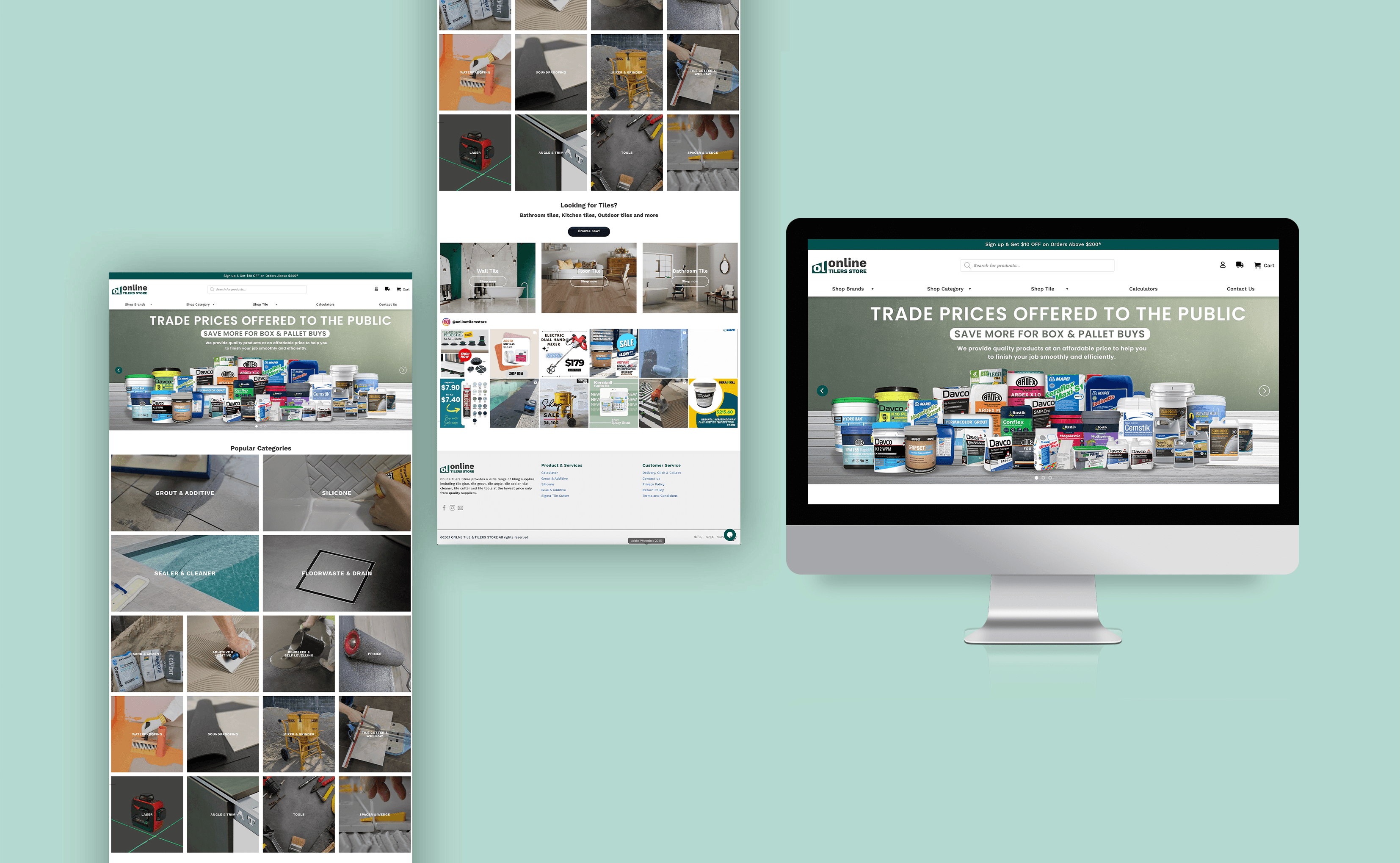
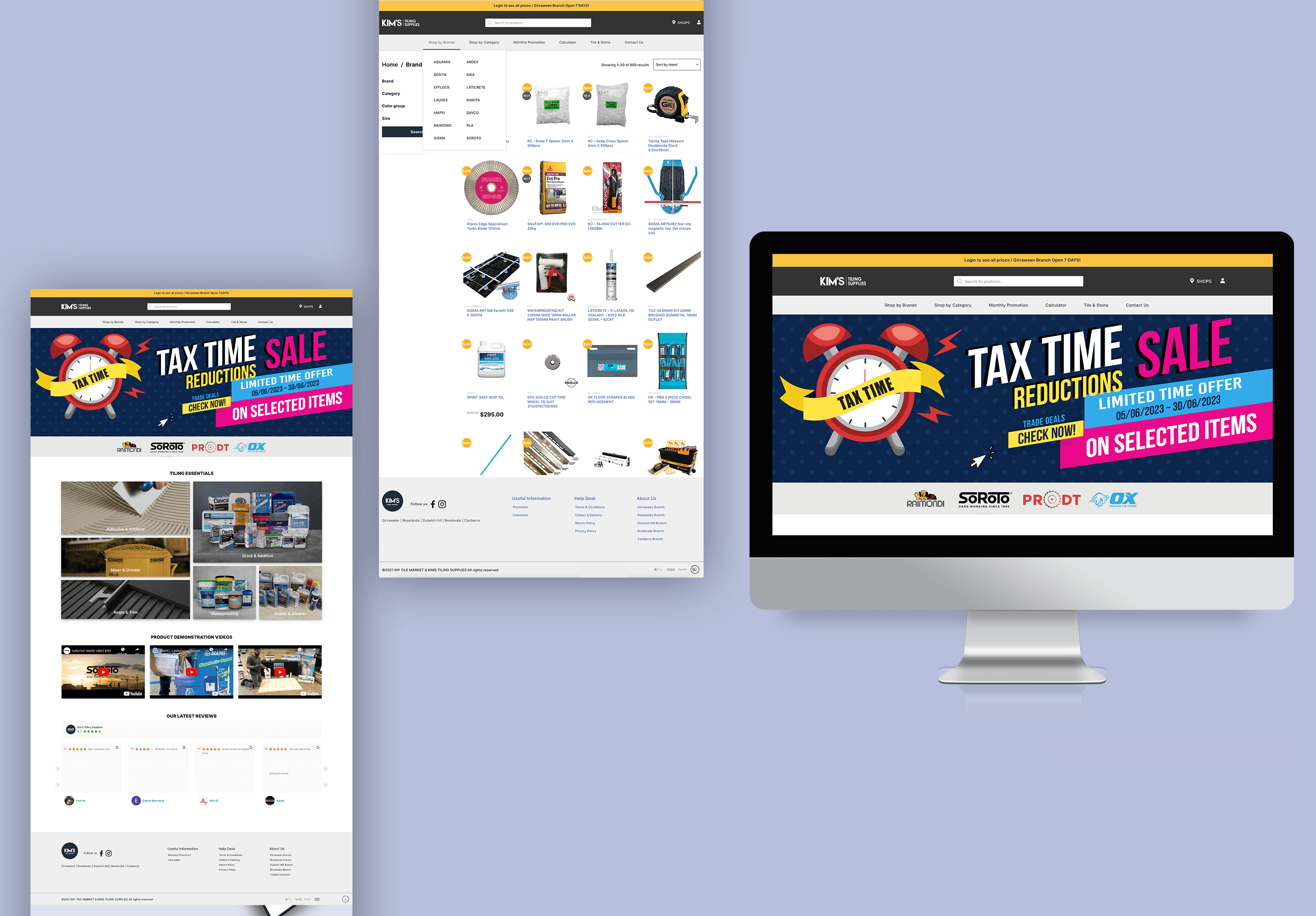
I was working across two pretty different worlds — the fast-paced F&B side and the more traditional building materials industry. The challenge was taking established, physical-world brands and getting them online without losing what made them recognisable. Managing five separate websites at once, plus custom offline marketing for individual café clients, meant there was a real risk of the brand looking different depending on where you saw it.
The Approach
To connect the offline and online sides properly, I got hands-on rather than relying on stock photography. I shot and styled the product photography myself, so every banner and printed poster came from the same visual foundation — which made it a lot easier to keep things consistent at scale.
The Execution
Shot and styled the products myself: Photographed beverages and tiles to get real, authentic assets — having a solid handle on lighting and composition made the promo videos and print materials noticeably better.
Kept five sites consistent: Managed five separate websites, including launching two new eCommerce stores. Built clear visual systems so the brand felt the same everywhere, even with a high volume of assets going out.
Custom in-store marketing: Designed posters and menu boards tailored to each café's space, while still keeping everything on-brand.
Used real customer feedback: Talked directly with customer support to understand what shoppers were actually struggling with, then used that to fix the visual hierarchy and overall shopping flow..
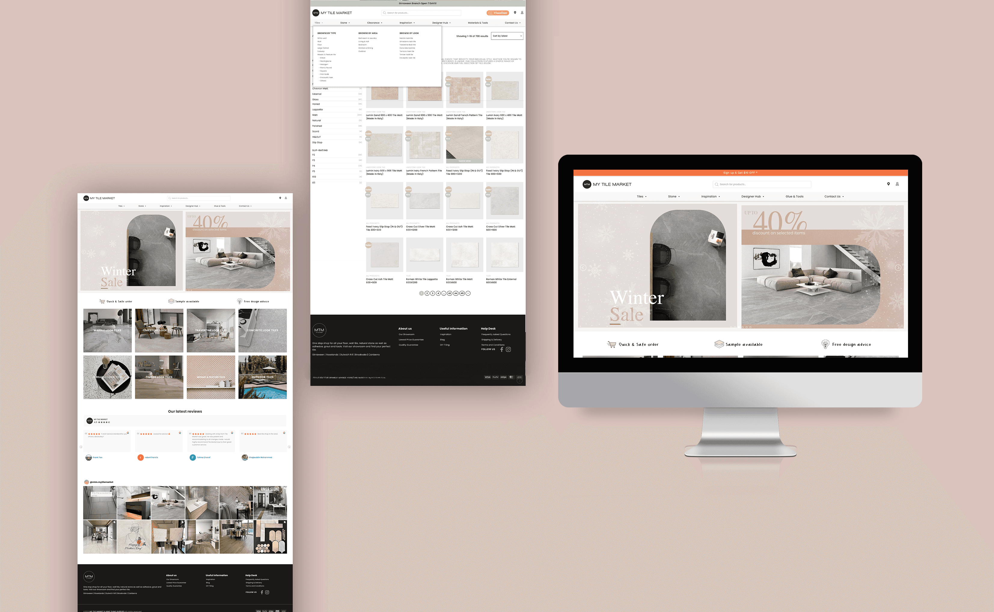
Cleaner navigation, a simpler UI, and a mobile-first rebuild made the site easier to use — which showed up directly in sales and in more customers coming back.