Understanding the Challenge
Pearler is an Australian fintech startup trying to make investing simple for everyday Australians. The real challenge was taking financial concepts that people find genuinely confusing or intimidating, and turning them into something that felt clear and trustworthy instead. That had to hold up everywhere — onboarding flows, pop-ups, landing pages, emails, pitch decks — on both desktop and mobile, without the brand feeling different depending on where you saw it.
The Approach
Instead of treating product UI and marketing as two separate jobs, I brought them under one visual language — clear hierarchy, considered typography, and custom illustration, all working to make things feel simpler and more trustworthy. That meant working closely with product and marketing so what someone saw in the app actually matched what they'd see on the website or in their inbox.
The Execution
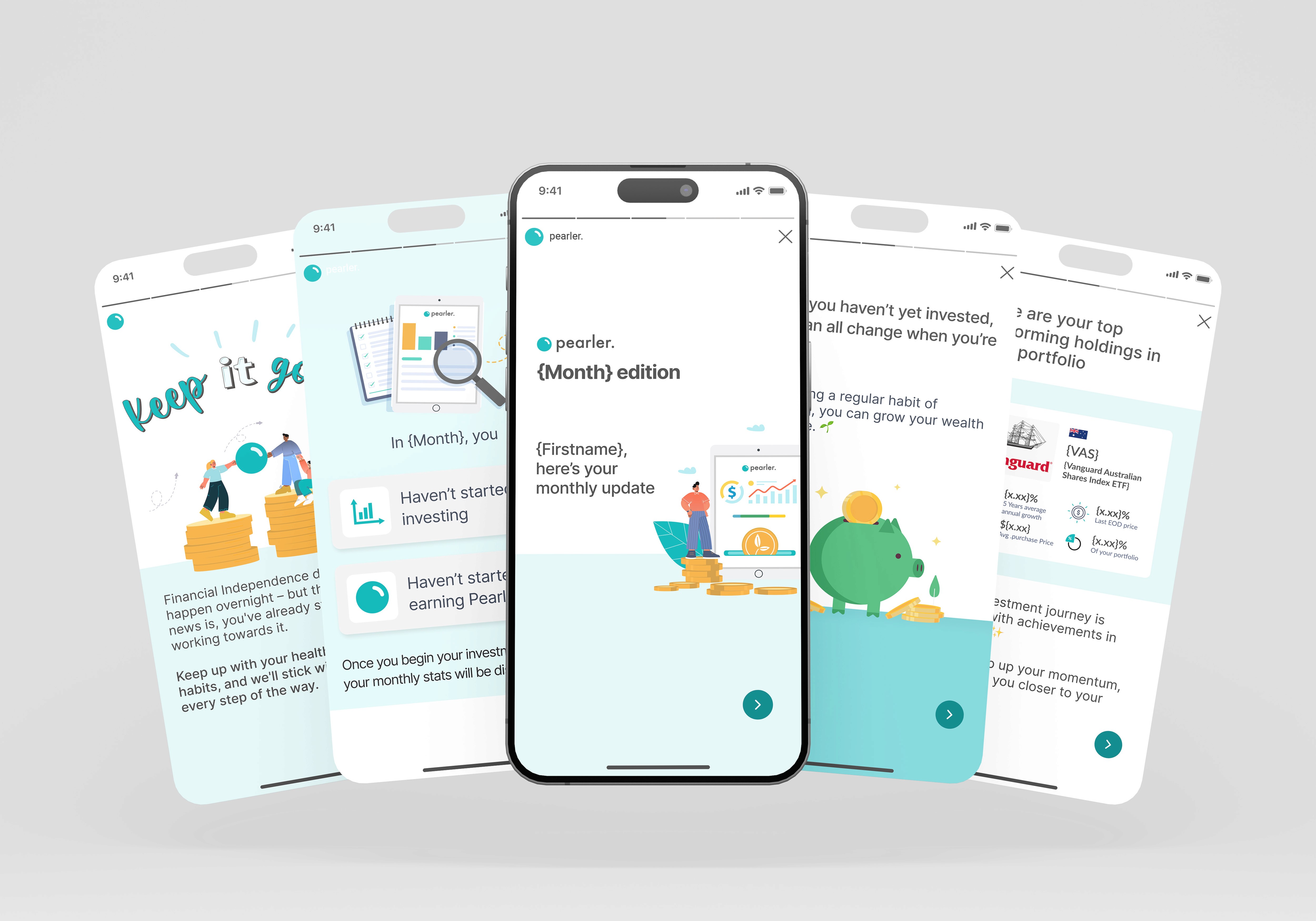
Product and onboarding UI: Designed desktop and mobile screens across onboarding and in-app pop-ups, breaking down investment concepts into clear steps that made account setup feel less overwhelming.
Marketing and website design: Designed landing pages that kept Pearler's approachable tone while still converting — so moving from the marketing site into the actual product didn't feel like a jump.
Illustration and visual assets: Created custom illustrations used across the product and marketing, turning abstract financial ideas into visuals that felt warm and human rather than corporate.
Marketing and stakeholder support: Put together email templates, pitch decks, and product mockups for campaigns and stakeholder presentations, keeping everything visually consistent.


Bringing product and marketing design under one system made Pearler's brand feel a lot more consistent — which matters a lot in fintech, where trust is everything. The simpler onboarding made a genuinely complex product feel approachable at the exact moment users needed confidence. And with a proper library of illustrations, templates, and mockups in place, the wider team could move faster on marketing without the quality dropping off.
